
Ricepe
A mobile app for recipe searching and grocery shopping designed for international students. Inside are handy navigation, carefully crafted filters, helpful directions, warm peers, and new ways to find your next favorite recipe. This is an app that transforms how you cook in a foreign country.
Advisor: Dominic Mentor
Role: Product Designer
Platform: Mobile App
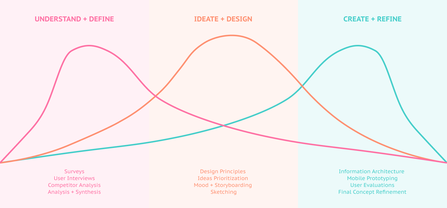
Duration: Sep 2018 - Jan 2019, 4 months


.png)


